Sadly, the icon garden was closed by 1997 as part of Job's reinvention of the company. It was a great place to meet and a public garden that Apple put in to get their Infinite Loop campus built in Cupertino.
Lots of employees were shocked and a bug report went around after they went missing... something like "missing icons on reboot. Still missing after finder recovery."
Before there was the android version garden... there were the mac icons...
One of the main reasons I find her so inspiring is that her work clearly shows why adding a great designer to a great team of engineers can result in ever lasting impact.
As a designer myself, I work with teams of engineers (mostly in the B2B SaaS Space [1]) who write great software but don't have the skills to design a delightful experience for their users. It's a shame there are still too many teams of talented engineers out there who don't see the importance of great design.
Indeed. I'm a software engineer in the defense industry, and there has never been budget for a designer on any contract I've worked on. So you end up with interfaces designed by engineers who hate doing UI work. Which is how you get big panels of identical gray buttons and layouts that make no sense (or put another way, some of these government systems make the Eclipse IDE look like the work of a UI/UX genius). Also, some of the more recent and publicly embarrassing incidents of UI-driven operator error :)
A few times I've said (well, not these exact words), "Give that UI to me, I may not be a professional designer or even an experienced front-end developer, but at least I care about making something usable." I was actually told once that I had to scrap my interface and re-do it, because it made the rest of the product look bad by comparison.
As an aside, I think you provide an obviously valuable service, wish I had come across it before I had done the UI for my current project :)
The Wikipedia article about dogcow states that someone else made it:
> In 1983, the dog icon had been created by Susan Kare as the glyph for "z", as part of the Cairo font. Later, when designing the classic Mac OS "Page Setup" print dialog box, an example image was required to demonstrate the orientation and color of the paper.[2] HCI engineer Annette Wagner made the decision to use that dog as a starting point, editing it and creating a larger version with spots to be more suitable for demonstrating various printing options. The new dog graphic had a more bovine look.
It claims that Susan Kare made the dog icon but Annette Wagner made dogcow based on it.
I got the impression that the dogcow was essentially a mistake, like stretching 4:3 to 16:9. The changes were intentionally (and manually) done to better fit with Page Setup, but it not intended to look like a cow or dogcow hybrid. I don't have any sources though, just something I think I read many years ago.
Totally shilling right now, but I got a physical set of the playing cards [1] that she designed for Windows 3.0 Solitaire, and I swear that it's one of my favorite novelty purchases.
I think the smile made quite a difference to people's perception of macs. I quite like stuff like that and the Reddit alien. Macs image seems to have shifted a bit from friendly boxes to cool thin things for the well off.
The existence of even cheaper computers does not make my point irrelevant. A larger proportion of the population can afford a Mac today than in 1984, and an even larger proportion still can afford a computer of any sort.
Cheap PC notebooks are really irrelevant when comparing with the Mac. A computer of the era that would compare with those would be a C64 or an Atari 800XL which were ~$300 then.
Mac's were pretty top of the line at the time (too much so in many ways, which raised the price). They'd be comparable to a high-end desktop now.
Apple go for the top segments. Perhaps some mid. Its part of their premium brand recognition. Whether that is still relevant these days, for every product, is another debate.
"Friendly" styling feels a lot more insincere these days. When a webapp from some startup is smiling at me during signup it just feels like it's overcompensating. Am I just more cynical now, or was it all just different when the Mac was introduced in a world of command-line DOS machines? Because I did really love the personality of the 90's Macs.
It’s weird, I’m a huge Macintosh fan today, but back in the nineties I found that “smile” to be insufferable and condescending. I thought it rang as hollow as those ads for insurance companies that describe their customers as “like family,” and I still have a knee-jerk annoyed feeling whenever I see the Finder icon.
But it’s somehow still worth it to get to use OS X every day...
Her web site is "kare.com". She's done icons for Apple, Microsoft, Autodesk, Facebook, Paypal... She's still doing graphic design.
Good icons are really hard. Most icons suck. Open source software icons especially suck. Open source people just do not seem to get communication through graphic design at all.
She is very talented, and has a good eye for proportion & shape. When you compare the classic black-and-white Macintosh to Amiga, GEM, OpenWindows, Windows 3.1, Windows 95 &c. you see that the Mac was head-and-shoulders above the rest.
Amiga Workbench and GEM [1] icons, fonts and chrome were some of the most aesthetically unpleasant designs ever. The proportions were all stretched out, and the icons were mostly ugly.
With Kare's icons, even the pixelation looked cute.
[1] I was briefly enchanted with GEM because it made my DOS machine look and feel like a Mac, but when I compared it to an actual Mac it looked horrible.
The Amiga desktop was such a missed opportunity. Take the first mass-market computer capable of high-resolution graphics in 4,096 colors and make the icons... wait for it... black, white, and orange on a blue background.
A friend of mine who was legally blind had an A1000. I sometimes wonder if it was only for the icons.
There's a reason for that color scheme. The OG Mac had a built-in, sharp, monochrome CRT. The Amiga was designed to be usable with whatever TV happened to be lying around. Hence the complementary pairs of black and white, and blue and orange: the only colors that would read well on the oldest, grottiest, junkiest b&w or color TVs. If you were editing HAM images in Deluxe Paint, obviously you'd want a high-quality monitor for that. But if you didn't have a high-quality monitor, the basic system UI would at least degrade well to be usable with what you had.
Function over form is a part of the Amiga design. Its graphical shell is called "Workbench" and not "Desktop" -- it was thought of as a computer for engineers and makers who were willing to forgo prettiness for practicality.
AmigaOS 1.x [0] is to me one of the most pleasant looking UIs ever. I'm sure my view is also influenced by nostalgia, but still, I love the color scheme, and then icons.
It's a shame they replaced the colors with a grey-in-grey nothingness starting in OS version 2.
Guess that just shows that one can't argue about taste :-)
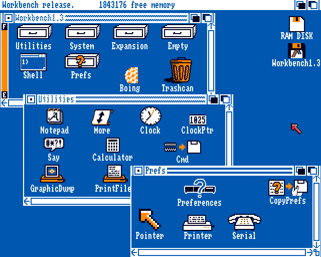
I grew up with that (workbench 1.3) and loved it. Clearly understandable icons and a colour scheme that (to me) seemed pleasant. Loved it back then and I still like it to this day.
Ah the icons of my youth, quite awesome. However, for me, the BeOS icon set has not been toped. When I first installed BeOS I remember being totally blown away by them.
> Every fifteen minutes or so, as I wrote this story, I moved my cursor northward to click on the disk in the Microsoft Word toolbar that indicates “Save.”
Gosh, cmd+S / ctrl+s doesn't work? Am I the only paranoiac that saves work every few seconds? Are all developers like that?
I picked up the "save" muscle memory from word processing on a Commodore 64.
Compute!'s SpeedScript, and later Paperback Writer both used C= S to save a document. And back in eight bit days, computers had more crashes than a wet NASCAR track. You learned strategies to keep from losing an entire afternoon's work.
no, you're not alone. the following keyboard sequence is practically muscle memory:
;<return><return><cmd-s>
if it's the end of a line of code followed quickly by another line of code, i just keep going. if there's a spot in the code where i decide to separate with a blank line, it's like a natural break point that deserves being saved. of the voices in my head, the one i tend to listen to the most is the one in the back screaming "Save, save often"!
I have problems sometimes adding an import in golang, then habitually hitting save which runs `go fmt` which removes the import. Sometimes it takes me 4 attempts before i can force myself to not save
My voice doesn't scream "save often" as much as "commit often" - once it's in a commit "git" has your back and you can always collapse it into other commits, ammend it, rebase or cherry-pick it, whatever.. It's not safe until it's a commit - saving is .. meh .. sure, needs to be done. Commit is what matters - then it is safe - at the very least I can dig it out of "git reflog".
Oh those memories, thank you Susan <3 I will never ever forget that bomb-icon. It scared me to death. I would run to my dad and ask him what I should do / had done wrong. So damn proud when I didn't have to ask him some time later bc I was prepared. (5 to 7 years old maybe back then)
The icons made the mac revolutionary? What a ridiculous exaggeration. The icons were an improvement over the "textual" xerox icons but it wasn't what made the mac revolutionary.
I agree. People had been doing bitmapped icons at least since the 70's. The Xerox Star (which the Mac copied) used them, too. The Mac's icons were good but were evolutionary, not revolutionary.
This article reminded me of a Microsoft designer who had created many WMP skins during the Windows XP era. I think she had a website/portfolio which I can no longer find unfortunately.
Experimenting with Winamp and Windows Media Player skins is why I now design and program UIs.
The Y2K aesthetic hits home better for me, because I grew up during that time and not earlier.
Most of the New Yorker articles I read are the size of novellas, so it feels a little strange that they have a very short article for someone who's had so much impact on anything related to computers over the years. Almost everyone in the world probably uses derivatives of her icons, with some direct and others inspired.
> When Jobs was asked what it was like to work with Rand, he said, “I asked him if he would come up with a few options, and he said, ‘No, I will solve your problem for you and you will pay me. You don’t have to use the solution. If you want options go talk to other people.’”
Watching the video with Steve Jobs talking about Paul Rand was really fascinating.
My two takeaways:
1. Paul Rand's IBM logo really was interesting because it predated emojis, but that is what it is.
2. Steve Jobs is a great speaker (duh). When he needs to think and respond, the stillness is amazing. This is very different to presentations because he is ready for it.
mine hasnt smiled in six years since I installed Gentoo. If anything its a haunted, war-weary stare as I casually insist it compile Chrome and LLVM again. Its a sullen scowl as I compile the latest stub kernel and pack it dutifully alongside dozens of others in the EFI partition.
Her work is extremely important to the Mac and to Apple, but I don't like hero worship articles. It was a team effort, and there were a lot of people responsible for making the Mac (and Apple) what they were/are.
When people wrote lots of hero worship articles about Jobs they missed the contributions of Kare and others. This quote does the same thing:
> “If the Mac turned out to be such a revolutionary object––a pet instead of a home appliance, a spark for the imagination instead of a mere work tool––it is thanks to Susan’s fonts and icons, which gave it voice, personality, style, and even a sense of humor. Cherry bomb, anyone?”
Her work is important and great, but she didn't do it in a vacuum.
It seems like every profile of someone nowadays has to make them out to be a singular genius who's work is of individual, utmost importance. It's not enough to just say "Hey look at this cool stuff this person did!" They have to be singularly responsible for something.
You missed my very simple point. It’s not that she had assistance in her role (though I’d wager she did not create all her icons in a vacuum, instead collaborating with others on the Mac team.)
I’ll restate my point plainly; hero worship articles about anyone who’s work is actually part of a team (all the many articles about Jobs are much worse than this one, for example) help paint a false picture in our society of the lone genius. This false narrative is harmful just for being false, but also helps lead people to feel like being a lone genius is an achievable goal and what one should strive for. Which of course leads to failure.
My problem is not with Kare or someone writing about her. My problem is with this author and many others writing in this way and denying the reality that geniuses of all kinds collaborate with others and are enriched for it.
https://www.quora.com/Where-did-Apples-icon-garden-sculpture...
Lots of employees were shocked and a bug report went around after they went missing... something like "missing icons on reboot. Still missing after finder recovery."
Before there was the android version garden... there were the mac icons...
http://clarus.chez-alice.fr/c_applegarden.php